Any tips on how to make character artwork look like this?
 Richard John S
Posts: 391
Richard John S
Posts: 391
I was wondering if anyone has any tips to offer on how to make character artwork look like the characters in this Resident Evil banner. Should I use 3delight over iray? What kind of Photoshop techniques etc.
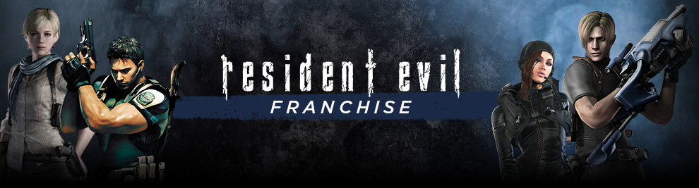
Capture.PNG
990 x 267 - 530K
Post edited by Richard John S on
Daz 3D is part of 
Connect
DAZ Productions, Inc.
7533 S Center View Ct #4664
West Jordan, UT 84084
Licensing Agreement | Terms of Service | Privacy Policy | EULA
© 2026 Daz Productions Inc. All Rights Reserved.
Comments
Not trying to be a smart aleck but what do you mean by "look like"? Because to me these characters look a lot like renders that are fairly easy to get out of DAZ Studio. Also, the characters in this image all look rather different to my eyes. The woman on the far left is more realistic than the man standing next to her, who is more stylized. She is low constrast, he is high-contrast. The woman on the right has an outfit that is very detailed, while the man next to her has one that is more simple & streamlined.
A number of things jump out at me:
Sorry if this stuff is too obvious or not technical enough. I'm not that much of 3D expert yet.
The characters in question are painted on and done by different artists with different skills and styles so I’m assuming you mean. Just similar. I’d experiment with getting dramatic lighting and downloading topaz labs and try some different painterly effects. In overlay mode you can darken and lighten select features so they look like les digitized and more painterly,
It's true. People will like work they perceive as being handmade more than work they perceive as being machine made, even when the machine made object has tighter tolerances for quality and is a much better product. For art, it's sort of irrelvant but for vehicles, homes, medicine, and lots of products it is very important.
For me the banner looks not so well made as the styles & lighting is not coherant.
The characters are not coherent because they all come from different video games. This poster is a celebration of the franchise and just throws them together on a banner for sale, they are not supposed to match. Each game comes with slightly different art styles. The technology available at the time can also effect art style. RE 1-4 were not HD, and thus tend to have less detail in character models.
I think somebody used Facegen to upload a few faces that look similar to the characters in the series.
You can also do that, too, if you can get good pics to work from.
3Delight for the short hair blonde and the extreme right character (not a RE fan, sorry)
deleted; couldn't think of anything positive to say really.
Thank you for this post. I've not heard of Topaz Labs before but I've just had a quick look at their website and I quite like the look of their products. I think I'l ldownload a few demos and give them a try.