Advice on what I can do better.
 jasonh04_f220df80f8
Posts: 27
jasonh04_f220df80f8
Posts: 27
Hey everyone I've done a couple of posts, and trying to activly be apart of the community here on the forums. I have a few peices I've done that I can post, and would like some advice on what I can do to improve my work. I won't take critique as a hurtful stab or all that. (Just as long as it's critique and advice no telling me my art is garbage. ) Below are some pictures I did for people on the roleplay forums I am a part of. These are their OCs I made for their profiles. The Minotaur I'm not happy with at all, because i am still struggling with making realistic fur (I know the lighting is crap on it but it was more focused on the for then anything. ) The fur was made in zbrush with fiber mesh
AA Commission.jpg
1029 x 1050 - 805K
Fwufkin.jpg
2212 x 2400 - 1M
Marius Pose JPG.jpg
803 x 1050 - 529K
Beefy.jpg
1948 x 3000 - 2M
Veronica OC.png
872 x 1600 - 4M
Post edited by jasonh04_f220df80f8 on
Daz 3D is part of 
Connect
DAZ Productions, Inc.
7533 S Center View Ct #4664
West Jordan, UT 84084
Licensing Agreement | Terms of Service | Privacy Policy | EULA
© 2026 Daz Productions Inc. All Rights Reserved.
Comments
Hi jasonh04_f220df80f8 ! You've come to a great place for advice.
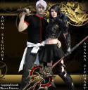
Adam and Ausaka Sieghart
LIGHTING:
While it is fully lit and has some depth of shadows, the light color doesn't fit with the background. Your light temperature is probably standard 6500 on all your lights and could be improved by being more than one dimensional. Since your background is post-work, you will need to approximate the lighting in your render.
1. Add a little gold color to the lighting. Sometimes it's easier to do that using the color picker rather than the temperature. The color of the greatest intensity should be coming from the right, perhaps as a rim light.
2. An alternative is to use a nice HDR environment which will add that hint of gold and some other colors to make the light multi-dimensional. I like this one, but there are many sets out there:
https://www.daz3d.com/iradiance-light-probe-hdr-lighting-for-iray
POSING:
Your posing isn't bad. Your characters appear to be balanced, but Adam is a little stiff. His left hand doesn't appear natural and it doesn't quite look like the sword is resting on his shoulder, probably because the base near the pommel is higher than his shoulder. Just a pet peeve of mine - the speer is seriously top-heavy and would require quite a bit of strength to hold it in that manner. Imagine if it were real - it would probably weigh 40 pounds.
EXPRESSIONS:
Ausaka's expression is good, while Adam's is a little bland. He looks bored. If you are looking for that surly look, increase the furrowing of the brows, and maybe turn down the corners of his mouth slightly.
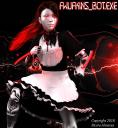
Fwufkins_Bot.exe
LIGHTING:
The two-toned lighting adds lots of interest. However, your white light is a little over-saturated - this is especially noticeable on the apron. To add depth, cut way down on your distant/spotlight and use a soft light directed on her face. This can be a mesh light, a linear pointlight, even a ghost light. Light would then be brighter at her face, dimmer on the rest of her body.
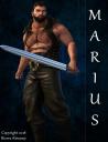
Marius
LIGHTING:
I like the lighting on this one - it fits with the background and is not stark white.
CROPPING:
The only issue I have with this render is that it is cropped too tight, which is obvious where the tip of the sword is resting on the edge of the render.
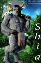
Shia
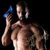
FUR:
I definitely agree with you regarding the fur. It's hard to get rendered fur to look good. In fact, I don't recall ever seeing fur on a humanoid figure that I liked at all. Perhaps try different shaders - some of the backlit hair shaders can really make a difference. You can also try a little painting in post work.
CROPPING:
This render is also cropped too tightly.
LIGHTING AND BACKGROUND:
The lighting just doesn't match the background. The lighting is harsh white from a distant or spotlight, while the background has soft shadows, and probably a little yellow or green to make the foliage pop.
POSING:
Again, it doesn't look like the handle of the ax is resting on his shoulder.
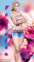
Veronica
LIGHTING:
The lighting here matches the background, though just a touch of rose tint would probably make it better.
CROPPING:
A little more space at the top would improve the overall look.
GENERAL ADVICE:
Lighting is one of those things that will improve as time goes on. Get yourself some nice HDR environment lighting sets (I'm referring to the ones without the picture background, turn Draw Dome to Off so they don't show up in the render) - these often have more than one color in the light which adds interest. The harsh shadows are caused by a distant/spotlight which is too bright. Turn that down and bring up your Environment Intensity (aka the ambient lighting) on the Render tab. Even adjusting the Environment Map setting can help. You can soften shadows by changing your Spotlight geometry to Disk or Sphere, or bringing the spotlight closer.
I recommend Rim Light Rig Iray - this is a great lighting set that brings in gorgeous rim lighting. As a bonus, it includes backlit hair shaders. Example:
https://www.daz3d.com/rim-light-rig-iray
Ice Star
Invest in a portrait studio, such as Boss Pro Lights:
https://www.daz3d.com/boss-pro-light-set-for-portraits-promos
Matching the color to a photo background can be pretty difficult, especially if you don't see it while you render. You can add the photo on the Environment tab by choosing Type: Backdrop and clicking on the down arrow next to Background and loading your photo. If you like the placement, you can even leave it there during the render, unless you plan on inserting special effects between the figure and the background in post work. Then just change Type to None before your final render to get rid of it.
Cropping - give your figures more space, it just looks better. Since you add the photo/background in post work, just make the image size larger and add your figure to it.
Cropping the feet out of the photo - try the shadow under the feet by turning Draw Ground to On in the Render Settings tab, Environment. Full-size portraits do look better with the feet. If the shadow obviously doesn't work, try putting your figure on a stand or a rock so there is a natural shadow cast on "solid" ground.
All in all, your renders are pretty good. Once you nail the lighting they will really come together.
Nice images.
Dracorn's made a lot of good points. The only thing I'd add is that, in the first image, Adam's right hand seems to be intersecting with the handle of the katana instead of holding it. Getting models to hold things in Daz is a royal pain. One trick that can be helpful is to position your viewpoint inside the handle and then move the joints of the fingers so that they just touch the surface. Once you've got it right, lock all the finger bones and parent the sword to the hand - then you can move the hand and arm until the sword is resting properly on his shoulder.