Bad Advertising format feedback
 SnowPheonix
Posts: 896
SnowPheonix
Posts: 896

I thought I would take a moment to point out that your advertising formatting was horrible and made it so I couldn't see anything on the page. Needless to say I didn't buy anything as a result so I'm sure you'll take action and not repeat that horrible formatting.. thanks.
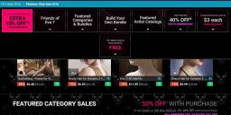
sale ad.jpg
1351 x 610 - 81K
Post edited by SnowPheonix on
Daz 3D is part of 
Connect
DAZ Productions, Inc.
7533 S Center View Ct #4664
West Jordan, UT 84084
Licensing Agreement | Terms of Service | Privacy Policy | EULA
© 2026 Daz Productions Inc. All Rights Reserved.
Comments
lol What?
There are a lot of sales going on, yes. But I don't see the formatting as being "horrible". It just takes a couple minutes to realize there are like 6 different sales/offers happening.
And you didn't buy anything? If you're a PC+ member you are missing out - seriously. This is the best sale of the year. I just got nearly $300 worth of content for only $7.
What on earth did you buy? I must be missing something!
A LOT! lol http://www.daz3d.com/forums/discussion/comment/1665296/#Comment_1665296
And all those offers have big square buttons on the main sale page which are scroll-locked to the top of my browser window. I can only see a narrow little window of the actual sale page as it zoomscrolls past. I agree 100% with SnowPheonix, the page design is a horribly bad idea.
I suggest using your browser's 'zoom out' functionality if it's that bad. It doesn't take up nearly as much space on my laptop screen, though, and I found the buttons useful for jumping around.
Its something with your either your picture or font size settings, or perhaps screen size settings. That bar with 8 items on it does not fit, so something is zoomed too large. This is my page:
See how the 8 links fit in the space. So CTRL+Mouse Wheel Up or Down to adjust the zoom level in your browser. The site has wacky issues, but this one is not Daz's fault.
Agreed- I have no problems viewing the page. With me, the issue is clutter. We've all said the double row of What's Hot is HORRID (I don't even look at it now, scroll past as fast as I can.) It's a very "busy" page. If you're not shopping, you're missing deals, but I understand the sentiment. When all the pictures started going missing, I didn't shop at all that day.
I understand what the OP is saying. Just look at his screenshot. None of the product images can show completely, Either the top of the images are showing and the pricing information is cut off, or the pricing and the bottom of the image show, but the top is cut off. Looks like the screen on a laptop. My monitor is 16:9 ratio, and I was cursing the design, too. I don't like to run my browser full screen, so the "buttons" across the top wrapped to two lines for me. And when I scroll down, the first row of images would jump when the buttons moved from the page to a fixed frame (?) across the top of the page, hiding the top of the images.
Thanks for the tip on zooming out using the mouse wheel, outrider42. I tend to forget I can use the zoom function. However, my browser uses all default fonts and my screen is set to 1920 x 1080. My browser window used the full height of the screen, though not the width.
I wonder if it would work better if those buttons were fixed vertically along one side or the other, and "flew out" to full width when one hovered the mouse over them... It would certainly work better for me, and I think for the OP as well.
The format is also completely unusuable for tablets, like, if you using iPad for surfing. I wanted to check out the sale on the way to work, but had to abandon it, as I saw next to nothing.
I found it quite remarkable that DAZ gave the whole site a "tablet inspired" look (lots of left-right "swiping", blocky iconography, large typography, etc) that turned out to perform so badly on actual tablets.