

Any more thoughts on this one before I submit it? I also have another one I'm working on that uses DoF more meaningfully but renders take forever especially when you have to evaluate focus...
omg wow is allI have to say about this version Dream!!! Beautifully done, love the look of the girl!!!!
Well, that's not working. I don't really understand f stop enough to be able to fix it. I tried zooming in enough to make a difference and the red pieces were almost non existent.
I tried to reframe everything and just messed it up. I moved the camera down but then the king was cut off at the top. I moved it the other way and the pawns were cut off at the bottom. I moved it left and right but then the girl was behind either the king or the queen. As it stands it is offset a little bit and not perfectly centered. It may not be all the way to the thirds area the way I would like it but it will have to do I guess.
I also noticed a weird shadow on her hand that I would like to get rid of but I'm not sure how. Moving the lights could really change everything.
The weekend is almost over and I probably won't have time during the week to mess with it or I would consider starting completely over from scratch.
Thanks for the input though. Much appreciated.
Did you check out flipmode's DOF tutorial? Its linked on the very first page.
it's really very good and should help you out. And when adjusting the DOF, it really helps to look at your camera from perspective view, rather than through your camera (after you've framed your shot of course). That way you can actually see the visual of the small red-green cross hairs which will show where your focal plane is, as well as the planes in front and in back which will show your area of sharp focus. Once you have everything framed how you want it, use the focal distance slider to put the crosshairs where you want your sharpest focus. And then just move the fstop down to decrease the area in focus, or increase fstop to increase the range of sharp focus. By looking at your camera, rather than through your camera, you will be able to see how these changes move the focal planes around and everything will make sense to you then. I've probably made this sound more confusing than it is. Just check out flipmode's tutorial.
Thanks Dvoraszenia, (and saintnever)
I made a few adjustments after looking at that tutorial you mentioned. I'm not sure if the result is an improvement or not.
Whattdya think?
This looks really good. The only thing I can see that is off a bit is the top of her middle finger is bent back just a tiny bit making it look off. If you bend that in so it just touches her face it will look more natural.
Rendered in 3Delight using LDP-R (night filter). Also applied blood splatters on Ogre's weapon, Ron's Ripped Fabric on his right hand cloth, and Ron's Mud on his left side. Suggestions welcome.
Your angel with the mace needs to be looking down at the ogre and be angled like she is going to jump on him and hit him. Maybe turn her a bit sideways as well, her wings seem to be caught in the three leaves. Right now, the pose looks like she is going to land on him feet first. I love the look on his face and your use of DOF is good and the contrast fo the muted colors for the background and the brighter ones for the characters works very well.
Any more thoughts on this one before I submit it? I also have another one I'm working on that uses DoF more meaningfully but renders take forever especially when you have to evaluate focus...
The scale feels a bit off—the raven, in particular, if very large compared to the girl and the skull—unless the girl is a fairy or something. Can you bring it down maybe 30%?
Found myself having yet another idea for my furry captain. I think that I'm done with my first corrador render and should try to think of a title.
P.S. BTW the set of this idea and the one just mentioned are by the same artist. A 3DC over at renderocity. I recomend looking them up and taking a look.
Cool prop! I didn't find it on renderocity, can you post a link to it?
I like the second image with the guy trying to catch up. My suggestion is to add more light to the 2 primary figures. Can't see face of the one next to cheetah girl because of dim lights.
Here is my lastest version, any suggestions or changes that should be done???
The dragon looks more like he's crashed into the ground than emerging from a cave/door...that could be due to the total lack of shadows and any directional lighting. The inside of that entrance is basically the same as the outside and without something to differentiate it, like shadows it just won't look 'right'.
Here is my lastest version, any suggestions or changes that should be done???
The dragon looks more like he's crashed into the ground than emerging from a cave/door...that could be due to the total lack of shadows and any directional lighting. The inside of that entrance is basically the same as the outside and without something to differentiate it, like shadows it just won't look 'right'.
Alright, now the camera's been tweaked to focus on her more and now there's some more background stuff. Anybody have suggestions on parts that need work or could be better?
Hello all. I have a couple of things I am working on for this contest before it ends one render in Bryce and one I am doing in the Daz Studio. I have not gotten far enough with the Daz Studio render project but here is the render from Bryce with a Depth of field for this contest.
Title: Mission Complete
Bryce 7 Render 20 hrs
Nice to see someone trying in Bryce! Though I never advanced as far as using DOF in brice. You did a good job, I like tha setting giving width and the colourful armor is givin a good contra to the other colours. Only thing bugging me is that the shadows of your figures and of the box are rather roughly pixelated. I would expect the ground to be more in focus around the guy in front and the box. Like this they are both lacking a bit of touch with the ground.
...I reeeeeeeally like DoF, so this contest is a blast for me! :D
Welcoem to the contest saintnever, yes it seems you'r havin a ball with the DOF, now witch ones of your renders do you want to pursue on for the contest?, Its a bit much commenting on all of them
Now that I've had a chance to get this properly uploaded, hopefully it displays better.
Anyway, I'm very new to rendering and came up with this for the contest. I've been struggling with lighting the most, so I would really appreciate feedback in regards to that, but any other feedback is certainly welcome!
The one below was my first shot at it. I had originally lit the scene with spotlighting. I really like the shadow, but it didn't seem to make sense to have a realistic lightsource casting that sort of shadow. The light coming in the window was also a bit off.
Now that I've had a chance to get this properly uploaded, hopefully it displays better.
Anyway, I'm very new to rendering and came up with this for the contest. I've been struggling with lighting the most, so I would really appreciate feedback in regards to that, but any other feedback is certainly welcome!
The one below was my first shot at it. I had originally lit the scene with spotlighting. I really like the shadow, but it didn't seem to make sense to have a realistic lightsource casting that sort of shadow. The light coming in the window was also a bit off.
Check to see if the camera headlight is on...it seems to be a little 'over lit', like the headlight causes.
Here is my lastest version, any suggestions or changes that should be done???
I like the story being told here, but I feel like the lighting could be better? It's so generalized i can't even figure out what the source would be. I'm a big fan of dramatic lighting, though....
I will do something about the size of the raven (and maybe the shine on it; I keep going back and forth and I'm still working out how to control shine/gloss/reflection with all the various sliders.) And thanks for your encouragement, Saphirewild!
This is the other one I'm working on. I'm trying to grub up the bottle and I keep playing around with the lighting HDR and details of the focus and all sorts of small things. I recently did some tests and found out my video card (GT745) alone only renders about twice as fast as my i7 cpu *tears* which makes reworking fine details SUCH A PAIN. Which is why the contests are so cool--stuff just for myself I'm more likely to let things slide with 'good enough'...
Anyhow....
"Missed Chances"
ETA: also have already moved the bottle so the flower isn't growing through it.
Your angel with the mace needs to be looking down at the ogre and be angled like she is going to jump on him and hit him. Maybe turn her a bit sideways as well, her wings seem to be caught in the three leaves. Right now, the pose looks like she is going to land on him feet first. I love the look on his face and your use of DOF is good and the contrast fo the muted colors for the background and the brighter ones for the characters works very well.
Thank you Ice Dragon Art for your feedback! I'll see what I can do about posing and positioning her better.
Alright, now the camera's been tweaked to focus on her more and now there's some more background stuff. Anybody have suggestions on parts that need work or could be better?
I am wondering about the apparent shine on her hoodie. The light source coming from behind her is causing some shininess that seems odd to me.
When I look at this image my eyes are drawn right to her face. I really like her lost-in-thought expression.
My updated portrait is done cooking. I think this is it. Anything that needs to be considered before I update my submission? Thanks for the useful suggestions, everyone.
I went back to this. I didn't like geometry in the background for a studio shot, but thought I should revise the background, so I lightened the shader on the background and used a contrast colored-light to give it some texture. With the camera pulled out, this hopefully shows off the depth of field more effectively. Color toning and film grain added in Photoshop/NIK Tools..
I checked out the link you provided for Peter Hurley. It helps to see what inspired your image. I notice Peter tends to use interesting shadows on most of the male models and more direct light on the women. He also uses a simple grey background to let the model be the focus.
Another thing Peter has done is all of his models are looking into the camera. But you have captured a feeling of having caught her in a moment of surprise.
My eyes are drawn directly to hers. The reflections on the glasses are not a distraction. The DOF is subtle but it is there. I do like a lighter background compared to the black you had used in the original image.
You have some strong colours and patterns in her head scarf so perhaps a strong solid background colour is best. Perhaps a dark blue or blue/grey to compliment the orange and pinks and help them pop.
I am wondering about the apparent shine on her hoodie. The light source coming from behind her is causing some shininess that seems odd to me.
When I look at this image my eyes are drawn right to her face. I really like her lost-in-thought expression.
Yay! That's exactly the reaction I've been hoping to cause! The hoodie, now... I've noticed that too, after I posted, and have been messing around with its surface to try and fix it, to no avail yet.
I am wondering about the apparent shine on her hoodie. The light source coming from behind her is causing some shininess that seems odd to me.
When I look at this image my eyes are drawn right to her face. I really like her lost-in-thought expression.
Yay! That's exactly the reaction I've been hoping to cause! The hoodie, now... I've noticed that too, after I posted, and have been messing around with its surface to try and fix it, to no avail yet.
Is it an Iray material on the hoodie?
If so, check the Glossy Roughness and if used Topcoat Roughness values...above 0.5 should get rid of that 'sheen'. You may have to go as high as 0.9.
The Glossy Roughness was .93 and there was no top coat. After a while of failing to make it less shiny, I used some of ParrotDolphin's Iray shaders, so I think that aspect's working better now.
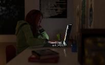
Still a bit grainy, though, so I think I'm going to push up both the samples and the time limit, then let it run most of tomorrow while I'm out on errands. Any recommendations before the monster render?
I did a complete rework of the scene, to hopefully incorporate depth of field a little better. Also reworked the lighting. I'm pretty happy with how this turned out. Not sure if the bottle in the foreground is too far out of focus. I'm much happier with the lighting with this pass.
Changed WarBird's pose and angle so that she appears to be ready to strike the ogre with her mace, rather than land on him. Added more light to the mace as well.
Also removed some stray branches from the tree with the geometry editor and changed her wing styles, so that she isn't brushing up against the leaves.
The Glossy Roughness was .93 and there was no top coat. After a while of failing to make it less shiny, I used some of ParrotDolphin's Iray shaders, so I think that aspect's working better now.
Still a bit grainy, though, so I think I'm going to push up both the samples and the time limit, then let it run most of tomorrow while I'm out on errands. Any recommendations before the monster render?
I like all the details here and I think you got the lighting right—but, oy! Iray doesn't like that kind of light level! I always find it frustrating to render low light scenes like this due to the difficulty in conquering the grain. You might do a test render with canvases enabled, and then crank up the toning settings to fake high levels of light in the scene, then use the .exr file instead of the render window file. That way, you can use a lower exposure level to achieve the same over look without the grain. I'm not sure if this will work, though, so I'd just try it with a small test before the final render (unless you've got a powerful GPU).
Comments
omg wow is allI have to say about this version Dream!!! Beautifully done, love the look of the girl!!!!
This looks really good. The only thing I can see that is off a bit is the top of her middle finger is bent back just a tiny bit making it look off. If you bend that in so it just touches her face it will look more natural.
Your angel with the mace needs to be looking down at the ogre and be angled like she is going to jump on him and hit him. Maybe turn her a bit sideways as well, her wings seem to be caught in the three leaves. Right now, the pose looks like she is going to land on him feet first. I love the look on his face and your use of DOF is good and the contrast fo the muted colors for the background and the brighter ones for the characters works very well.
The scale feels a bit off—the raven, in particular, if very large compared to the girl and the skull—unless the girl is a fairy or something. Can you bring it down maybe 30%?
https://www.renderosity.com/mod/bcs/vendor/3-d-c should take you to the artest store page.
Here is my lastest version, any suggestions or changes that should be done???
Here is another WIP I am working on Charactor is yet another freebie Morph Calling her Lorna Lane.
The dragon looks more like he's crashed into the ground than emerging from a cave/door...that could be due to the total lack of shadows and any directional lighting. The inside of that entrance is basically the same as the outside and without something to differentiate it, like shadows it just won't look 'right'.
Again, without shadows, she's just floating there...
I'm assuming, that from the looks you are using 3Delight for both of these...
The other thing is the lighting isn't matching the scene.
Thanks for the quick feedback MJC, I will redo both them and see what I can do about both lighting and shadows.
Alright, now the camera's been tweaked to focus on her more and now there's some more background stuff. Anybody have suggestions on parts that need work or could be better?
Nice to see someone trying in Bryce! Though I never advanced as far as using DOF in brice. You did a good job, I like tha setting giving width and the colourful armor is givin a good contra to the other colours. Only thing bugging me is that the shadows of your figures and of the box are rather roughly pixelated. I would expect the ground to be more in focus around the guy in front and the box. Like this they are both lacking a bit of touch with the ground.
Welcoem to the contest saintnever, yes it seems you'r havin a ball with the DOF, now witch ones of your renders do you want to pursue on for the contest?, Its a bit much commenting on all of them
"Secrets over sunset"
Now that I've had a chance to get this properly uploaded, hopefully it displays better.
Anyway, I'm very new to rendering and came up with this for the contest. I've been struggling with lighting the most, so I would really appreciate feedback in regards to that, but any other feedback is certainly welcome!
The one below was my first shot at it. I had originally lit the scene with spotlighting. I really like the shadow, but it didn't seem to make sense to have a realistic lightsource casting that sort of shadow. The light coming in the window was also a bit off.
Check to see if the camera headlight is on...it seems to be a little 'over lit', like the headlight causes.
I like the story being told here, but I feel like the lighting could be better? It's so generalized i can't even figure out what the source would be. I'm a big fan of dramatic lighting, though....
I will do something about the size of the raven (and maybe the shine on it; I keep going back and forth and I'm still working out how to control shine/gloss/reflection with all the various sliders.) And thanks for your encouragement, Saphirewild!
This is the other one I'm working on. I'm trying to grub up the bottle and I keep playing around with the lighting HDR and details of the focus and all sorts of small things. I recently did some tests and found out my video card (GT745) alone only renders about twice as fast as my i7 cpu *tears* which makes reworking fine details SUCH A PAIN. Which is why the contests are so cool--stuff just for myself I'm more likely to let things slide with 'good enough'...
Anyhow....
"Missed Chances"
ETA: also have already moved the bottle so the flower isn't growing through it.
Thank you Ice Dragon Art for your feedback! I'll see what I can do about posing and positioning her better.
I am wondering about the apparent shine on her hoodie. The light source coming from behind her is causing some shininess that seems odd to me.
When I look at this image my eyes are drawn right to her face. I really like her lost-in-thought expression.
My updated portrait is done cooking. I think this is it. Anything that needs to be considered before I update my submission? Thanks for the useful suggestions, everyone.
I checked out the link you provided for Peter Hurley. It helps to see what inspired your image. I notice Peter tends to use interesting shadows on most of the male models and more direct light on the women. He also uses a simple grey background to let the model be the focus.
Another thing Peter has done is all of his models are looking into the camera. But you have captured a feeling of having caught her in a moment of surprise.
My eyes are drawn directly to hers. The reflections on the glasses are not a distraction. The DOF is subtle but it is there. I do like a lighter background compared to the black you had used in the original image.
You have some strong colours and patterns in her head scarf so perhaps a strong solid background colour is best. Perhaps a dark blue or blue/grey to compliment the orange and pinks and help them pop.
Yay! That's exactly the reaction I've been hoping to cause! The hoodie, now... I've noticed that too, after I posted, and have been messing around with its surface to try and fix it, to no avail yet.
Is it an Iray material on the hoodie?
If so, check the Glossy Roughness and if used Topcoat Roughness values...above 0.5 should get rid of that 'sheen'. You may have to go as high as 0.9.
The Glossy Roughness was .93 and there was no top coat. After a while of failing to make it less shiny, I used some of ParrotDolphin's Iray shaders, so I think that aspect's working better now.
Still a bit grainy, though, so I think I'm going to push up both the samples and the time limit, then let it run most of tomorrow while I'm out on errands. Any recommendations before the monster render?
I did a complete rework of the scene, to hopefully incorporate depth of field a little better. Also reworked the lighting. I'm pretty happy with how this turned out. Not sure if the bottle in the foreground is too far out of focus. I'm much happier with the lighting with this pass.
time is almost up. I was able to rerender my first project
"Mission Complete"
Bryce
my second is a DAZ studio
Title "Escaping the howler"
Changed WarBird's pose and angle so that she appears to be ready to strike the ogre with her mace, rather than land on him. Added more light to the mace as well.
Also removed some stray branches from the tree with the geometry editor and changed her wing styles, so that she isn't brushing up against the leaves.
Here's version c of this one. I doubt that I'll have time to make any changes so this is it.
Think that I'll call it "Breefing the Captain"
I like all the details here and I think you got the lighting right—but, oy! Iray doesn't like that kind of light level! I always find it frustrating to render low light scenes like this due to the difficulty in conquering the grain. You might do a test render with canvases enabled, and then crank up the toning settings to fake high levels of light in the scene, then use the .exr file instead of the render window file. That way, you can use a lower exposure level to achieve the same over look without the grain. I'm not sure if this will work, though, so I'd just try it with a small test before the final render (unless you've got a powerful GPU).
I was not able to rerender the other 2 projects so I am posting a new one
I used a suttle DOF on the taxi sign and part of the roof