The Seeds of Things
 rogerben
Posts: 0
rogerben
Posts: 0
I've wanted to put together a comic of some sort since I was a kid, but it wasn't until this year that I decided to focus and make it happen. Part of what motivated me was the iPad... with a stylus and apps like Procreate, I finally had a creative surface that I could manage. (I have essential tremor, so conventional ink and paint are problematic, and most free-standing digital surfaces like a Cintiq are just as bad.)
The other thing that got me going was finding Daz (and the associated 3D rendering subculture) back in January or February. I'm just getting to the point where I know enough to know I don't know much, which in my experience, is where things either get frustrating or interesting. So far, it's remained interesting. Interesting enough to risk being told I suck in public. :)
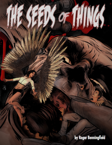
So, with a deep breath, I'm attaching a shot of the cover image, and a link to my blog, where the downloadable ebook versions of the preview edition live.
As far as the 3D stuff in the cover shot, wow, that would be a long list. Epic Wings, Wicked Dance Fevah, Magus, SY's hoodie, M5, V5, PM's Margaret, S4 for Genesis, Bad Guy, Hyde, Smay's Zombies, Town & Country, DieTrying's morphs, Creature Creator, Gen Face & Body, Gen Expressions, Gen Firearms, Jasmin's lights, Wildmane, Hampton, the Troll's mouth... I honestly don't remember everything that's been stirred into the pot.
Daz 3D is part of 
Connect
DAZ Productions, Inc.
7533 S Center View Ct #4664
West Jordan, UT 84084
Licensing Agreement | Terms of Service | Privacy Policy | EULA
© 2026 Daz Productions Inc. All Rights Reserved.
Comments
Thank you for sharing that! I'm glad the hoodie was of use to you. :-)
I love to see my products turn up in renders, but especially when it's in something that looks this awesome.
Hi, it looks very nice.
The preview reads well, the pacing is good, the art panels convey great story driven imagery and the dialogue has the right balance of quirky and smart with a healthy amount of dark humor. Well done! The book itself deserves a better front cover though, and a more stylized logo like title because at first glance its the front cover that attracts a reader, and the pages inside are better than the current front cover suggests. I'm definitely looking forward to find out what happens next.
Again, thanks! I wasn't really sure about posting this stuff here... after all, from a certain POV, I'm wrecking some good renders. :)
Thank you!
I've been a comic geek for 40 years and your work is awesome! The final colored page had a Mike Allred vibe :cheese:
I agree with FirstBastion. The cover should look way different and be more compelling; in many cases it's the reason why people buy an issue. I remember feeling gypped when the cover art didn't match the insides but as I grew up and appreciated the writing more I got over it :lol:
Thanks for the kind words, and I'm in complete agreement about the cover. I kinda like it on its own terms, but it isn't representative of the preview's interior, and the quickie title treatment needs major rethinking.
All told, I'm just thrilled it made sense! :)
I totally get that. To be honest, I was in a hurry for a concept, and did what a million other people before me have done... tried to insert my characters into a lame homage to Kirby's first FF cover. :D
Here's a few loose panels, unlettered and uncropped.
A WIP... I've been making lots of tweaks to the character designs, as well as shifting to color.
More WIP... full page layouts this time. I've really been struggling with story structure and pacing, which has slowed my progress to a crawl. If anyone wants to read what I have so far and constructively crush my ego (heh), let me know.