COPIED!
Sections
Always use a new <section> for rows. to add default top/bottom padding, shown below. There is no left/right padding at this level.
Center Aligned
Use class .ta-center
When elements are center-aligned there is no need to worry about padding, unless the section is very copy-heavy, shown below.
Lorem ipsum dolor sit amet, consectetur adipiscing elit. Integer non nisi id purus blandit porttitor sed a mauris. Vivamus egestas magna sem, a iaculis tortor consectetur vel. Vestibulum finibus tortor ac lacus condimentum, eu euismod est hendrerit. Curabitur mollis, nunc vitae ultricies placerat, augue urna placerat tortor, eu dignissim nunc felis in ante. Maecenas facilisis orci non accumsan maximus. Sed finibus, nisl at porttitor pellentesque, nisl urna rhoncus ex, non bibendum ipsum enim vel ligula. Ut laoreet tortor vel dolor sollicitudin, eu tincidunt orci porttitor. Maecenas scelerisque augue ut nisi sollicitudin interdum. Quisque eu ipsum sem. Praesent aliquam magna odio, at imperdiet nulla ornare eget.
Right Aligned
Use class .ta-rgt
When elements are right-aligned, adding some right padding/margin may be necessary.
Left Aligned
Use class .ta-lft
When elements are left-aligned, adding some left padding/margin may be necessary.
Page Content
Create a nested <div> with the .page_content class to add default left/right padding, shown below.
Center Aligned
Use class .ta-center
This works fine for center-aligned elements and allows for other elements to fill more of the screen. In addition, when the section is very copy-heavy, the content is constrained better.
Best use for center aligned copy is for smaller chunks of text broken into paragraphs.
Right aligned
Use class .ta-rgt
When elements are right-aligned padding is already managed by the page content wrapper.
Left aligned
Use class .ta-lft
When elements are left-aligned padding is already managed by the page content wrapper
Fonts
Sizes:
H1: Lorem Ipsum
use <h1> tag or .h1 class
H2: Lorem Ipsum use <h2> tag or .h2 class
H3: Lorem Ipsum use <h3> tag or .h3 class
H4: Lorem Ipsum use <h4> tag or .h4 class
H5: Lorem Ipsum (for disclaimers) use <h5> tag or .h5 class
P:Lorem ipsum dolor sit amet, consectetur adipiscing elit. Integer non nisi id purus blandit porttitor sed a mauris. Vivamus egestas magna sem, a iaculis tortor consectetur vel. Vestibulum finibus tortor ac lacus condimentum, eu euismod est hendrerit. Curabitur mollis, nunc vitae ultricies placerat, augue urna placerat tortor, eu dignissim nunc felis in ante. Maecenas facilisis orci non accumsan maximus. Sed finibus, nisl at porttitor pellentesque, nisl urna rhoncus ex, non bibendum ipsum enim vel ligula. Ut laoreet tortor vel dolor sollicitudin, eu tincidunt orci porttitor. Maecenas scelerisque augue ut nisi sollicitudin interdum. Quisque eu ipsum sem. Praesent aliquam magna odio, at imperdiet nulla ornare eget.
Weights:
-
Font Weight 100
Use class .fw-100
H1 Sample
H2 Sample
H3 Sample
H4 Sample
H5 Sample
P Sample
-
Font Weight 200
Use class .fw-200
H1 Sample
H2 Sample
H3 Sample
H4 Sample
H5 Sample
P Sample
-
Font Weight 300
Use class .fw-300
H1 Sample
H2 Sample
H3 Sample
H4 Sample
H5 Sample
P Sample
-
Font Weight 400
Use class .fw-400
H1 Sample
H2 Sample
H3 Sample
H4 Sample
H5 Sample
P Sample
-
Font Weight 500
Use class .fw-500
H1 Sample
H2 Sample
H3 Sample
H4 Sample
H5 Sample
P Sample
-
Font Weight 600
Use class .fw-600
H1 Sample
H2 Sample
H3 Sample
H4 Sample
H5 Sample
P Sample
-
Font Weight 700
Use class .fw-700
H1 Sample
H2 Sample
H3 Sample
H4 Sample
H5 Sample
P Sample
-
Font Weight 800
Use class .fw-800
H1 Sample
H2 Sample
H3 Sample
H4 Sample
H5 Sample
P Sample
-
Font Weight 900
Use class .fw-900
H1 Sample
H2 Sample
H3 Sample
H4 Sample
H5 Sample
P Sample
-
Font Weight Bold
Use class .fw-bold
H1 Sample
H2 Sample
H3 Sample
H4 Sample
H5 Sample
P Sample
Line Height:
-
Line Height 0.9
Use class .lh-0.9
Lorem ipsum dolor sit amet, consectetur adipiscing elit. Integer non nisi id purus blandit porttitor sed a mauris. Vivamus egestas magna sem, a iaculis tortor consectetur vel. Vestibulum finibus tortor ac lacus condimentum, eu euismod est hendrerit. Curabitur mollis, nunc vitae ultricies placerat, augue urna placerat tortor, eu dignissim nunc felis in ante.
-
Line Height 1
Use class .lh-1
Lorem ipsum dolor sit amet, consectetur adipiscing elit. Integer non nisi id purus blandit porttitor sed a mauris. Vivamus egestas magna sem, a iaculis tortor consectetur vel. Vestibulum finibus tortor ac lacus condimentum, eu euismod est hendrerit. Curabitur mollis, nunc vitae ultricies placerat, augue urna placerat tortor, eu dignissim nunc felis in ante.
-
Line Height 1.1
Use class .lh-1.1
Lorem ipsum dolor sit amet, consectetur adipiscing elit. Integer non nisi id purus blandit porttitor sed a mauris. Vivamus egestas magna sem, a iaculis tortor consectetur vel. Vestibulum finibus tortor ac lacus condimentum, eu euismod est hendrerit. Curabitur mollis, nunc vitae ultricies placerat, augue urna placerat tortor, eu dignissim nunc felis in ante.
-
Line Height 1.2
Use class .lh-1.2
Lorem ipsum dolor sit amet, consectetur adipiscing elit. Integer non nisi id purus blandit porttitor sed a mauris. Vivamus egestas magna sem, a iaculis tortor consectetur vel. Vestibulum finibus tortor ac lacus condimentum, eu euismod est hendrerit. Curabitur mollis, nunc vitae ultricies placerat, augue urna placerat tortor, eu dignissim nunc felis in ante.
-
Line Height 1.3
Use class .lh-1.3
Lorem ipsum dolor sit amet, consectetur adipiscing elit. Integer non nisi id purus blandit porttitor sed a mauris. Vivamus egestas magna sem, a iaculis tortor consectetur vel. Vestibulum finibus tortor ac lacus condimentum, eu euismod est hendrerit. Curabitur mollis, nunc vitae ultricies placerat, augue urna placerat tortor, eu dignissim nunc felis in ante.
-
Line Height 1.4
Use class .lh-1.4
Lorem ipsum dolor sit amet, consectetur adipiscing elit. Integer non nisi id purus blandit porttitor sed a mauris. Vivamus egestas magna sem, a iaculis tortor consectetur vel. Vestibulum finibus tortor ac lacus condimentum, eu euismod est hendrerit. Curabitur mollis, nunc vitae ultricies placerat, augue urna placerat tortor, eu dignissim nunc felis in ante.
-
Line Height 1.5
Use class .lh-1.5
Lorem ipsum dolor sit amet, consectetur adipiscing elit. Integer non nisi id purus blandit porttitor sed a mauris. Vivamus egestas magna sem, a iaculis tortor consectetur vel. Vestibulum finibus tortor ac lacus condimentum, eu euismod est hendrerit. Curabitur mollis, nunc vitae ultricies placerat, augue urna placerat tortor, eu dignissim nunc felis in ante.
-
Line Height 1.6
Use class .lh-1.6
Lorem ipsum dolor sit amet, consectetur adipiscing elit. Integer non nisi id purus blandit porttitor sed a mauris. Vivamus egestas magna sem, a iaculis tortor consectetur vel. Vestibulum finibus tortor ac lacus condimentum, eu euismod est hendrerit. Curabitur mollis, nunc vitae ultricies placerat, augue urna placerat tortor, eu dignissim nunc felis in ante.
-
Line Height 1.7
Use class .lh-1.7
Lorem ipsum dolor sit amet, consectetur adipiscing elit. Integer non nisi id purus blandit porttitor sed a mauris. Vivamus egestas magna sem, a iaculis tortor consectetur vel. Vestibulum finibus tortor ac lacus condimentum, eu euismod est hendrerit. Curabitur mollis, nunc vitae ultricies placerat, augue urna placerat tortor, eu dignissim nunc felis in ante.
FontDaz Glyphs
These icons are similar to Font Awesome or Favicon Glyphs. They can be called with CSS classes or using HTML Entities.
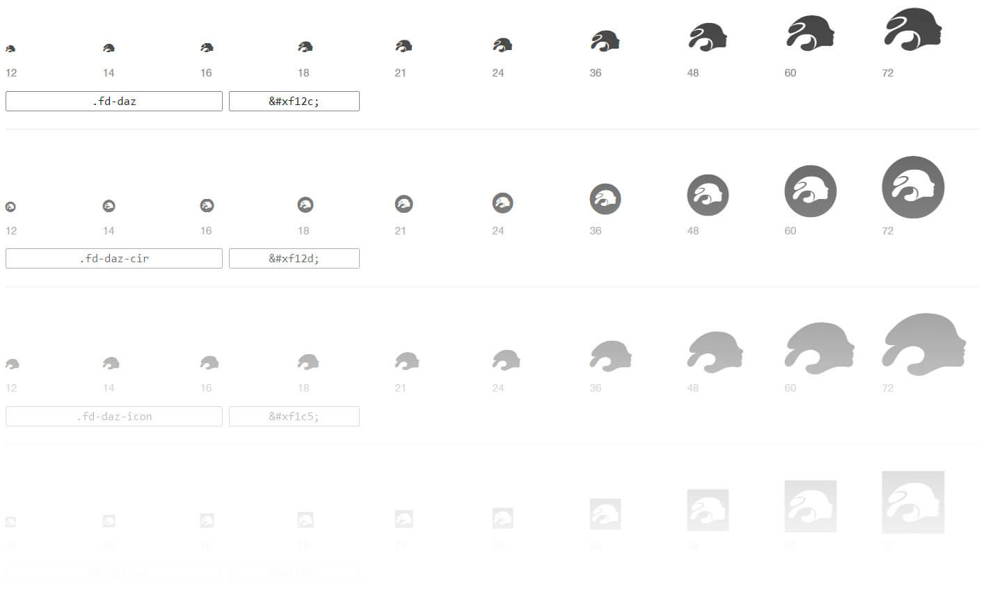
A full list can be found here: https://cdn.daz3d.com/file/dazcdn/media/skin/frontend/enterprise/daznew/styleguide/fontdaz-preview.html.
Colors
-
#000000
Fonts
use class .c-black
Backgrounds
use class .bg-black
-
#ffffff
Fonts
use class .c-white
Backgrounds
use class .bg-white
-
#25d0a4
Fonts
use class .c-green
Backgrounds
use class .bg-daz-green
-
#4a3bfd
Fonts
use class .c-royal
Backgrounds
use class .bg-royal
-
#3635ff
Fonts
use class .c-marine
Backgrounds
use class .bg-marine
-
#aa25ff
Fonts
use class .c-violet
Backgrounds
use class .bg-violet
-
#6f0833
Fonts
use class .c-dark-violet
Backgrounds
use class .bg-dark-violet
-
#00c279
Fonts
use class .c-apple
Backgrounds
use class .bg-apple
-
#c11a60
Fonts
use class .c-rose
Backgrounds
use class .bg-rose
-
#ffa82e
Fonts
use class .c-tangerine
Backgrounds
use class .bg-tangerine
-
#7c878e
Fonts
use class .c-dark-gray
Backgrounds
use class .bg-dark-gray
-
#d0d3d4
Fonts
use class .c-gray
Backgrounds
use class .bg-gray
-
#d9d9d6
Fonts
use class .c-light-gray
Backgrounds
use class .bg-light-gray
Hovers
When using a font color for a link it may be necessary to use an additional hover state. There are currently to pre-sets, one for dark and one for light background. View esamples below.
-
Use class .hov-dark together with a color class like .c-royal
Make sure to have the hover class after the color class to ensure proper override like so:
a <class="c-royal hov-dark">
For Light Backgrounds -
Use class .hov-light together with a color class like .c-tangerine
Make sure to have the hover class after the color class to ensure proper override like so:
a <class="c-tangerine hov-light">
For Dark Backgrounds
Utility Classes
Use the following classes for precise layout/positioning adjustments.
Widths:
-
Width: auto
Use class .w-auto
-
Width: 100%
Use class .w-100%
-
Width: 0
Use class .w-0
-
Width: 75%
Use class .w-75%
-
Width: 50%
Use class .w-50%
-
Width: 25%
Use class .w-25%
Heights:
-
Max Height: auto
Use class .maxh-auto
-
Max Height: 100%
Use class .maxh-100%
-
Max Height: None
Use class .maxh-none
-
Max Height: 0
Use class .maxh-0
-
Max Height: 75%
Use class .maxh-75%
-
Max Height: 50%
Use class .maxh-50%
-
Max Height: 25%
Use class .maxh-25%
Margins:
Margin
-
Auto: .m-auto
sample
samplesamplesample
sample
-
0: .m-0
sample
samplesamplesample
sample
-
1rem: .m-1
sample
samplesamplesample
sample
-
2rem: .m-2
sample
samplesamplesample
sample
-
3rem: .m-3
sample
samplesamplesample
sample
-
4rem: .m-4
sample
samplesamplesample
sample
-
5rem: .m-5
sample
samplesamplesample
sample
Margin Top
-
Auto: .mt-auto
sample
sample
-
0: .mt-0
sample
sample
-
1rem: .mt-1
sample
sample
-
2rem: .mt-2
sample
sample
-
3rem: .mt-3
sample
sample
-
4rem: .mt-4
sample
sample
-
5rem: .mt-5
sample
sample
Margin Right
-
Auto: .mr-auto
samplesample
-
Auto: .mr-0
samplesample
-
1rem: .mr-1
samplesample
-
2rem: .mr-2
samplesample
-
3rem: .mr-3
samplesample
-
4rem: .mr-4
samplesample
-
5rem: .mr-5
samplesample
Margin Bottom
-
Auto: .mb-auto
sample
sample
-
0: .mb-0
sample
sample
-
1rem: .mb-1
sample
sample
-
2rem: .mb-2
sample
sample
-
3rem: .mb-3
sample
sample
-
4rem: .mb-4
sample
sample
-
5rem: .mb-5
sample
sample
Margin Left
-
Auto: .ml-auto
samplesample
-
Auto: .ml-0
samplesample
-
1rem: .ml-1
samplesample
-
2rem: .ml-2
samplesample
-
3rem: .ml-3
samplesample
-
4rem: .ml-4
samplesample
-
5rem: .ml-5
samplesample
Flexbox
Use the following classes for various Flexbox orientations.
Parent Container
-
Display Flex
Use class .d-flx
-
Display Inline Flex
Use class .d-iflx
-
Flex No Wrap
Use class .flxw-nowrap
-
Flex Wrap
Use class .flxw-wrap
-
Flex Wrap Reverse
Use class .flxw-wrap-reverse
Animate On Scroll
Implementation and use ...
CSS Animate
Implementation and use ...
Daz 3D is part of 
Connect
DAZ Productions, Inc.
7533 S Center View Ct #4664
West Jordan, UT 84084
Licensing Agreement | Terms of Service | Privacy Policy | EULA
© 2026 Daz Productions Inc. All Rights Reserved.