January 2018 New User 3D Art Challenge - Composition
 Kismet2012
Posts: 4,252
Kismet2012
Posts: 4,252
New User's Challenge - January 2018
Sponsored by DAZ 3D
Are you new to the 3D World? Are you at the beginning stages of learning 3D rendering? Have you been around for a little bit but feel you could benefit from some feedback or instruction? Have you been around awhile and would like to help other members start their creative journey? Well then come and join the fun as we host our newest render challenge!
"Composition"
This is a general render challenge with the focus on how you compose your image. We are providing you with lots of great links on Composition from a variety of sources. Composition is key to pulling a viewer into your image and leading their eye to where you want them to see things. It is a fundamental skill that we, as artists, not only need to learn, but will continue to hone over the years. Read about and look at the examples, in these articles, for how composition works and how artists, from the Masters to people like you and me, put these compositional guidelines to use to make our pieces more appealing and invite the viewer to look around your image as you intended.
General Composition Rules:
http://design.tutsplus.com/articles/5-fundamental-skills-every-artist-should-master--psd-28054
The Golden Ratio:
https://holycrop.wordpress.com/tag/golden-spiral/
https://designschool.canva.com/blog/what-is-the-golden-ratio/
http://www.hongkiat.com/blog/golden-ratio-in-moden-designs/
https://www.youtube.com/watch?v=8A3JnWzgXGk
Some Tools for DS and Bryce:
Golden Rules Camera Prop v1.5 by Jaderail
Golden Rules Composition Helpers for Bryce by David Brinnen and Horo
Artists, filmmakers and photographers share similar traits in how we present our work, so you will find that a study of the art of photography will help, which is why you see various links to photographic articles included.
Photography Composition:
http://digital-photography-school.com/5-elements-of-composition-in-photography/
http://digital-photography-school.com/5-more-elements-of-composition-in-photography/
Color can be used as a compositional element, especially when you have color contrast. Here are some fundamentals on color:
Color Fundamentals:
http://www.tigercolor.com/color-lab/color-theory/color-theory-intro.htm
Other Types of Contrast:
http://www.neilblevins.com/cg_education/composition_contrasts/composition_contrasts.htm
http://photoinf.com/General/NAVY/Contrast_and_Framing.htm
Examples of Composition:
http://www.cybercollege.com/comp_ex.htm
http://www.cybercollege.com/comp_ex2.htm
http://www.pinterest.com/dawnshiree/rules-of-composition/
This is a bit of a long read but offers excellent examples of different kinds of composition and camera angles.
The Cinematography of "The Incredibles"
Prior Composition Challenges:
Daz Tutorials
I will be checking in as will the rest of the Community Volunteers to try and help with anything you all may need.
For a list of the current challenge rules, please see this thread : Challenge Rules
Closing Date: January 31st 2018
Daz 3D is part of 
Connect
DAZ Productions, Inc.
224 S 200 W, Suite #250
Salt Lake City, UT 84101
Licensing Agreement | Terms of Service | Privacy Policy | EULA
© 2024 Daz Productions Inc. All Rights Reserved.
Comments
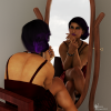
A first Draft of my idea. Things I'm working right now, are the hair of both of them, and her makeup. Ive aligned their faces and their bodycenters on the two horizontal lines of the "third grit" to get a nice composition. Also I angled the camera slightly up, to achieve a little bit more balance in the overall picture.
A great start HighElf. Posing 2 figures to interact like that and make it look natural isn't easy. Well done.
Here's my start. Haven't decided on how to populate this yet though.
An interesting setting. So much could happen depending on who, what and where you place your characters.
Looking forward to seeing what you do with this scene.
The posing on this is wonderful, and the shapes have a lovely organic flow. The draping on both his shirt and her outfit are also really nicely done. DForce?
I like this already - but I'm a fan of strong lines and curves, with just enough asymmetry to make it interesting. Can't wait to see what you do with it.
Don't think that I knew about that one. To make it clear how long it's been sence my friend and I have been to the movies, the last one we saw was 'The A-Team'.
Here's version b. A little more texture work, and added a character in the background along with three node instances of them.
I think your middle figure is intersecting the railing.
*wonders what they are up to*
Yes. I've used dForce on her Dress. His shirt on the othher hand has this nice flow on it's own. That's why I choosed this outfir.
Fow the pose I've used a premade pose,and adjusted and modified it to my needs. It's far easier this way, than doing everthing from scratch. Currently I'm waiting for the render to be finished. than I can show the current progress.
Here it is. I couldn't get rid of this strange wavepattern in her hair. So I transitioned the right portion of her hair, behind her shoulder. Also I changed his Hairstyle a little bit to make a more natural looking point of contact on their foreheads.
Currently I'm thinking of lighting. Here I used two modified spotlights. A Key and a Rim Light, Both a set to a rectangular geometry and the Rim is illuminated as Diffuse only. My current Colortemperature is 3'200 Kelvin. I'm still not convinced by the color.
What your thoughts about this state of the picture?
I've noticed hairs have weird things going on when you get into poses like this. I think, though I may completely wrong here, is that when we auto fit hair to figures it follows different morphs and thus when you have longer hair it's fitting and following morphs other than say the head which we'd want. There's a way to go into the the properties of the hair and stop it from following along, but I can't really remember how to do that. I'm sure it's somewhere in a tutorial or someone much more advanced here can comment on it. But what you did works great anyway, good work around.
For the color, I think it just depends on personal preference. I think it's a bit dark, but I get it's supposed to be intimate. I'm a fan of cool, harsh tones so I like a lot of blue and cold lighting, so obviously it's something different than what I gravitate to.
Version c here. while there wasn't any intersecting of the railing going on he was actually overlaping the consol behind him, so move the instances around some. Also did a little more texture work as well.
Getting hair posed and looking natural can be a challenge.
I love the simplicity of this image. The couple are the focus and my eyes are drawn right to their faces.
If it can be done without losing the intimacy of this image perhaps another light focused on their faces. Something soft to go along with the intimacy of the image.
Maybe that is what I was seeing. Looks much better.
Hey HighElf, this looks great and the pose and expression of both fits so well.
Let people interact with each other, is one of the great chalenges in Daz (beneath, the light, the material setting, the expression... ;) ) but you composition looks very pleasant for my eye.
Great start so far. This time there is a great atmosphere of urgency in your work. The running soldiers let us know that time seems to runs out.
This time I think the scene is to bright. (unbelievable... I know! )
I think the glow from the water is great but to bright. I would try to reduce the illumination until the ceiling swap into dark and I think a water shader would make the look even better.
But as we see this is only a startpoint and it looks very promesing.
Ok, the scene looks quite empty until now, but so, kismet will have a better look at the outfit, because I was not sure, if it goes conform with the ToS.
This time I will try to make a more complex scene with all the great things that I have bought and collect in the last few weeks.
Here you see She Orc for G8 with the samurai hair and the hills in the background are from the wonderfull terradome set.
daybird
Sweet. You got a great foundation here. What I would consider, is vertical symmetry. A thing I learned from a professional photographer is, that balance can be achieved by using the same amount of space between two opposite edges and doing this with both edge pairs. You have done this very well with the side edges. Maybe you should give it a try to do this also with the upper and the bottom edge. So far I love this start.
Shinji Ikari 9th: I love the overall exposure. But I agree with daybird, the brightness of the liquid, seems currently a little bit off. Same goes for the pink signal light above the door. The atmosphere on the other side, is awesome. Seeing this image I'm remembering my time in the shadows of seattle. I'm foward to see how this picture progresses.
the panty seems very low cut there but its hard to tell as it has a similar colour to the skin, if she's holding a skull by some hair in front of her it would be ok ;)
Soft enough? Or too bright? ;)
Too bright for me. You have lost those soft shadows that gave the image an intimate feel.
I thought so also. *scrapped the fill light*
TITLE: VampHunter
SOFTWARE: Daz3d, iRay Render (Photoshop only to fix clipping on clothing in a few spots)
I think the falling guy is wrecking the image lol. He feels like he was rendered in a different engine almost or maybe it's just the clothing material that messes with me. I may not keep him in the scene if I can't get his act together.
The Vampire that just landed has blacked out eye's. I am not sure if I will leave them blacked out or not yet. I like her pose but want her head to be able to tilt more up to the hunter so that she is looking at his face instead of center mass.
The innocent lady in the back I am pretty happy with.
Yeah the falling guy's got to go...
I tend to agree with most of your assessment. I am not sure the "falling guy's" problem is the texture of his clothes or his posing. His fall doesn't quite look natural to the eye but I am not sure what needs to be adjusted to fix the pose.
After a quick Google search it looks like your figure might need to be rotate slightly to his right along the axis going through his waist. This would bring his left leg down a bit and his right arm up. He seems to be twisted a little too much towards the camera. If this makes sense to you.
The attached image is for reference only.
Yeah I see what your saying! Thanks:)
Lol, this was a great entry and the writing on the ground makes me laugh.
Please hold the falling guy in the scene, I like him and his reaction very much!!!
Because of her black eyes, I tend to give them another color. Until now it looks like her eyes where closed.
What I like the most is the camera position left behind her opponent and how you blurred him with the focus on her.
Maybe you should even do the same with the people behind her, but I'm not sure about that.
Lol...yeah I figured someone would pickup on that writing!
I will likely give her eyes a different color. I think I can fix the falling guy and I agree about the DoF. I want him more blurred but he is so close to her and on the same plane as the angle of the camera that it will take some tinkering to get it all to come together.
Thanks!