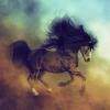
New image and not sure which variation I like the best?
 Ladyfyre
Posts: 58
Ladyfyre
Posts: 58
Well after excitedly reading the posts about the new horse model I thought I'd post here about my blogpost from yesterday.
I've been working on a portrait of my welsh cob Cruz for a print to hang in my house using the MilHorse and my own morphs and textures. I rendered the horse in DS 4.5 and added background, hair and postworked in photoshop but wasn't happy with the finished result, it seemed to lack something I can't put my finger on, so ended up playing around and several different variation later now I don't know which I like the best!
I posted on my blog and twitter yesterday asking for input but didn't receive and replies so was hoping some of the lovely peeps on here would help me out?
Daz 3D is part of 
Connect
DAZ Productions, Inc.
224 S 200 W, Suite #250
Salt Lake City, UT 84101
Licensing Agreement | Terms of Service | Privacy Policy | EULA
© 2024 Daz Productions Inc. All Rights Reserved.
Comments
Nice horse, good pose and composition, effective postwork variations -- I'd say your problem is the lighting in the render, it looks like you've got a spotlight on the horse's front end that's not reaching to the back. Which is okay if that's the effect you're going for, but there doesn't seem to be any reason for it and (IMHO) it's distracting. Have you considered using Distant Lights?
In the render below on the left I used the light array shown in my Simple Sunshine and SkySphere tutorial, with all the fill lights on Intensity 32.0%, and the Sunlight on Shadow Type: Raytraced, Shadow Softness: 1.0%, Shadow Bias 0.50, and Intensity: 80%. On the right is the same render run through the postwork steps shown in my Bright Sunlight Mini-Tutorial, with the Saturation Overlay layer at 100% opacity, one Contrast Mask layer at 100% opacity, and one Contrast Mask layer at 32% opacity. Hope this helps!
Great job on the textures, Ladyfyre-Graphics !
I like horsie 1 the most, beautiful color, the others are a bit too yellowish for me. Can't decide wich background i like best, nr 2 or 3.
Personally, i would add some ambient/overall lighting and go a little easier on the spotlight-effect. Or maybe a little backlighting to get a nice rim around horsie (partically the back-end).
PS : i'm not a very experienced renderer, so i'm probably not the best person around to give any advice on these matters, but i really liked your horsie and just wanted to put my 2 cents in ;-)
Thank you for you reply, I'll check out your tutorial once I've finished up testing the new horse model, it really makes a difference in your renders! I usually use distant lights and more so now combine them with the UberEnvironment lights but was going for a more dramatic, studio type look here which is why I was trying out spotlights. I agree that a bright rim light would have really shown it up better though.
I've attached the raw render so you can see my lighting better.
Thank you BlackFeather :) I like number 1 best too I think, but I also like a few of the others, just not spot on about any of them, a rim light would have been better, I wonder if I can simulate the effect in photoshop?
(following is totally imho - and IANAA* - so feel free to ignore me ^_^...)
I agree with Kickair - with a camera angle like that, the lack of illumination on the butt seems a little strange to my eye... consequently, I liked horsie #2 best, followed up by #5, mainly because those were the ones with the most even illumination (although I feel the yellowness could have been toned down a little).
Perhaps a little more ambient light and/or a rimlight, and possibly blur the background a bit more, to make the foreground (horse) "pop" out of the picture?.
The other alternative, if you _really_ only want the front of the horse, would be to darken ambient a lot more - I still remember a "girl and horse" image from ... wow 2009... by Phoenix1966:
http://www.renderosity.com/mod/gallery/full.php?member&image_id=1981751
... in which case the entire body of the horse was not visible.
And yeah, if you want an immediate ragbag of (usually opposing) opinions, just post on the DAZ Commons ;-).
*I am not an artist ;-)
Hi M F M, I appreciate your insights and that image on Rosity is gorgeous! I almost spat out my healthy herbal tea all over my monitor when I read you ragbag comments lol, I should be used to that my oh plays devils advocate just for the fun of it all the time, infuriating but can be insightful.
They are all nice renders and for me it is tough to choose. I think number 1 is my favorite but number 2 shows some great texture, and I presume number 5 (in lower left) is also well done.