FaxMischers' WIP thread
 FaxMisher
Posts: 102
FaxMisher
Posts: 102
in Art Studio
So my goals for this thread are as follows:
1) having a place to post my work so that someone besides me sees it;
2) taking the opportunity to get feedback on my work so I can make better progress towards improvement;
3) give other people a chance to get to know me better;
4) and finally, to get the opportunity to get to know other people with similar interests.
FIrst up - a render of a couple of horses in the woods.
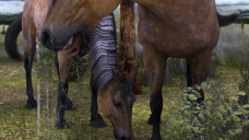
Horses.png
1280 x 720 - 1M
Daz 3D is part of 
Connect
DAZ Productions, Inc.
224 S 200 W, Suite #250
Salt Lake City, UT 84101
Licensing Agreement | Terms of Service | Privacy Policy | EULA
© 2024 Daz Productions Inc. All Rights Reserved.
Comments
Welcome to the Art Studio and to Daz! This particular forum is a great place to get all kinds of advice and get to know people. Also, you should come check out the newbie competition every month as well. Will shorten your learning curve exponentially. Lots and lots of advice focused on one thing, different every month. Here is the link to this months thread. . Looking forward to seeing more of you work and getting to know you.
Welcome! This is a great place to get advice and feedback and the New Users Contest that Sonja linked to above is also great. One thing you might wan to consider is pulling back on your image a little and frame the horses a little wider.
Here are a few links that might help:
A Guide on Good and Bad Places to Crop on Your Portrait Subject
What the Crop? Part 1 Tension
What the Crop? Part 2 Gesture
What the Crop? Part 3: Body Parts
There isn't a whole lot on cropping with animals. Animal photography is its own whole subject. I would think, though, that cropping that little bit of nose might not be a good idea. I would either pull it back to have the foal's whole face or crop closer and isolate the eyes for more interest.
Thanks for the welcome! Glad to have a place to share my work and see what other people are doing.
@Ice Dragon Art - I have my entry started for this months contest. I started entries for the last 2 contests, but got bogged down with other things and couldn't make a good go of it. This month is different though! I'm making time for working on my entry and time for interacting on the forum a priority. And what you said about the learning curve is true - using the structure of the monthly contest to focus on improving on one element at a time has helped me out alot.
@Knittingmommy - Thanks for the links and the suggestions. My fine arts background predisposes me to do things differently, so I experiment with my work alot. I'm not great about producing and showing work that is 'techincally proficeint' because I tend to go off on tangents I find more interesting than developing a technical adeptness. The framing is a byproduct of a conegenitally rebellious nature that I'm really tryng to get a handle on. :)
I have a lot of other work I haven't shown yet, and I'm really bad at organizing things in a linear fashion. So in a Herculean effort to stay more organized, for now I'll keep the focus of this thread on the horses. I'll work on the framing in conjunction with the theme of this months contest - and work on the materials too.
BTW, I have some questions about organizing my files and UV mapping. I'll take a look at the other threads, but if someone could point me in a good direction, surely the gods will smile upon them. (I'm a nerd. )
)
Welcome!
As mentioned above, this is a great place to get feedback, as is the new users competition. I look forward to seeing more of your work!
Install issues have kept me from working on modeling until now - but I had to recreate pretty much everything I had before. So here are 3 new renders, each of the same scene, but from a different angle.
I want it to seem as if these 2 horses have come out of a forest, and now see an open plain, where they can graze easier, and run and play or gallop or whatever else it is wild horses would do in an open plain.
Can anyone help me blend the sky dome into the cyclorama background? They both came with the Millenium environment package, so I figured they'd work more seamlessly. Am I not doing it right?
Please comment too if you've got some constructive suggestions.
So to compliment the horse renders, here's a cowboy. Gianni 7, Cowboy outift for Genesis 3, the Undertakers environment, the shotgun and holster for Renegade outfit for Genesis 3, together make a hard looking cowboy. Granted, I did a little shape shifting with Gianni to make him a little less 'big', but I like this character. I'll probably keep working with him.
When you change the angle on the middle one you will have to rotate and play with the placement of the environment so that it covers everything in your view port. Or you can size it up so it fills the whole scene but that sometimes causes stretching. You are doing a nice job on using the depth of field!
Having some fun with Daz.
So I'm working on learning to texture right now. This render features Jamzmine for V7 wearing Ozichicks Lazy Night Panties. It is a pretty simple outfit, so changing the texture is not such a big challenge. I'm finding though, that the real challenge is in putting together good patterns, colors, and textures.
So here is my first attempt at working with textures on outfits. It's very subtle, which I thing goes along with the idea of an outfit meant for a 'lazy night' at home. I really like this render, and am happy with most of it. The major exception is the distortion of the texture on the folds of the outfit, mainly on the bottoms. I'm not sure how to get rid of that aside from keeping the patterning and detail out of the texture and just working with color. I'm starting another texture for ths outfit now, and I'll keep you posted on my progress. Thanks for looking!
On another note, I've gone back to working with Daz Horse 2. I love the model and the renders it can help produce. I'm attempting to make a new skin for the horse, it's very difficult. I'll post my work on that in a bit. But first a couple renders also including the western saddle. Enjoy!
Ah, believe me, I know all about going off on tangents and doing things differently! And, even though I gave those links, I think they are just things to be aware of and not necessarily something to be held as gospel. Sometimes, artists just have to shake things up. Best part of being an artist is being able to do things your way. Sometimes, you might even do things just for that jarring effect that others think should never be done.
Ah, if you happen on a great way to organize, let me know. That's something I still struggle with both in my life and in my hard drive. :) Organized, I am NOT!
I think my favorite image so far is that first horse running in the last post. It has a great sense of action and is really well done. :)
Im so good at starting new things, It's hard to finish any of them. Such is my dilemma with the New User Contests. So instead of clogging up that thread with my renders, I'll be putting them here until I come up with something I can call finished and enter.
This months contest is about lighting, so I've started a number or renders with that in mind. Each has different challenges associated with it, so my efforts get spread in a number of different directions.
FIrst off, I decided that since I'm still pretty new to Daz and 3D in general, figuring out the entire scene and concept beforehand might be a bit ambitious. So I decided to start with an environment, and try different lighting concepts and camera angles.
A couple more renders using different lighting but the same angle.
The subtle differences can make all the difference in the world. Playing with the softness of the light coming through the window, and the amount of indirect lighting falling on the rest of the scene.
As you can see Im a fan of Kubrick. Although he wasn't the first to exploit the geometry of perspective, he did it well.
So what about the rest of the scene? I have a big open space with somewhat dramatic lightingnow. The perfect backdrop for...what?
Maybe a spaceship - very surreal.
This series very roughly approximates my lighting process.
For January's new user contest, I continued to use the Antares model in my rendering while I tried to develope an entry that focused on the use of composition.
I wanted to create a sense of subdued danger, and sublime terror. Lol. Seriously, that's what I was going for.
The character barely hangs onto the outside of a spaceship traveling through deep space at astronomical speeds. If her grip slips, she'd be stranded in literally the middle of nowhere, and who knows how long it would take for the ship to slow down and change course to try and find her to pick her up.
So that's the context I was trying to work within. I tried to use a strong diagonal line to indicate the dynamics of the scene. I tried several different camera angles and ways of framing the scene. Showing the unimaginable scale of deep space, while trying to maintain a human perspective of it was challenging.
Here's a character I've been working on now for awhile. I'm a lot more comfortable with posing, lighting, composing and rendering. Still feeling uneasy about texturing and creating and applying materials. Eventually I'd like to be producing models of clothing, environments, characters and such. I'm working with Blender right now as well, learning more about manipulating meshes and all that. UV mapping is a major pain, but I figure working with premade templates can give me practice with photoshopping textures and materials.
Until the point I'm a better modeler, I'll stick with kit-bashing.
Here are a coule examples of an outfit I put together for blaire. As you can clearly see below, she's the bees knees.
So I've wanted to create a simple finished model to sell/share for a long time. I'll try as best I can to share my progress here, and I'll attempt to do the whole thing by the end of the day. My challenge: to create a model of a box of cigarettes.
My first sketches, with approximate measurements are below.
Here is the first basic shape:
The next series deals with adding more detail to important pieces of the model. I inset the open end of the cigarette and messed with the mesh at the end to simulate some tobacco. I'm thinking I can use displacement maps and bump mapping to add further dimension to the surface of packed tobacco.
I added a couple of more details to the cigarette: I marked a seam running the length as sharp, so hopefully it will show up as a small detail of the end of the rolling paper used to roll the cigarette in the final renders. I also scaled a loop near the end of the cigarette where the filter would be. I put this right around the area where the filter would end and the packed tobacco would begin.
I made the body of the cigarette and the tobacco at the end 2 different pieces so that I could deform the end easier. After applying smoothing to the body of the cigarette and joing the 2 together.
So here are the cigarettes themselves, sans packaging, which I hope to work on tomorrow. Right now these only have textures applied to them. I made the textures in Photoshop, no bump or displacement or spec maps yet. Theres a couple of issues I have with the models , but I'm not totally unhappy with them. These are probably the first 'complete' 3d models I've made yet, and I'll let myself bask in the afterglow for a bit before I start pointing out the mistakes. Smoke'em if you gottem.
I had to disassemble the plumbing under the kitchen sink, clear out the clogged spaghetti, give everything a good cleaning and reassemble it. That sucked up a good day of the weekend, but the plumbing is in the best shape it's been in for years. So there's that.
Anyways, I've finally gotten around to modeling the cigarette box. I've got a closed version, and an opened version now. It took some finegaling (did I spell that right?) to get the cigs to sit in the box alright, but they look just fine. It is a different sort of a challenge though to fit 20 cigarettes into a box - with 3 rows it comes out to 2 rows of 7 cigarettes and 1 row of 6 - I suppose if I knew about how to work with collision shaping them as a group would be easier. Anyways, I have UV maps for the cigrettes and the closed box. Still working on the UV maps for the open box, and then it's off to texture them.
I'm going to have some fun with the branding. I came up with a company and initial logo already, now I'm going to try and flesh the idea out more. Any comments or question would be welcome.
Here are a couple more images of the models before they get skinned.
I've been taking some time off of the cigarettes, and working on some other things. Here's another character I've put together, still working out the shading, texturing and background elements.
I'm attempting to work with Iray mats, but the lighting is quite different from 3DL. I like the outfit, the pose, and the character overall - but I'm not crazy about the shading, lighting or background yet.
Here's a new character based off Gray for Gianni 7. I started out making this as a test for practicing lighting for the February Lighting Themed new user contest.
By the way, I'm wondering when the cut-off point for being considered a new user is... If anyone has a good answer feel free to share it.
Anyways, I saw a really powerful picture the other day - and it got me thinking about a new approach to creating scenes. This is the first of a possible series of scenes of people trying to have some semblence of normalcy after a catastrophic disaster. In this case I'm using Stonemason's "After the war" as the backdrop. This guy is having tea where his living room used to be. I can get into posing, so I spent a fair amount of time making the pose.
Putting together the outfit was pretty simple, it's the Grantham Hall Suit for G2m by Sarsa, Mada, and Daz Originals. As I needed practice with materials and shaders, I chose to shade the whole suit with Iray shaders. I need to learn how to bake textures. Actually I need to work on creating my own textures and shaders.
I actually started creating the character by working on the facial hair. I used Whiskers for G3M by Laticis Imagery, which I'm glad to have. The hair is Pure Classic: Hair for Genesis. I literally had to wrestle that model onto Gray's head. It put up a decent fight, but in the end I like the way it looks.
The tea cup comes courtesy of LaurieS and the A Curious Tea: Drink me model. I spent a good solid hour at least posing the hand and fingers around the cup. Of course from this angle you can't see that. Lol. I'll keep using this character though, and the pose.
The lighting comes from Colm Jackson's TerraDome3 for Iray. Since I'm using a Mac, my abililty to utilize Iray is really handicapped. I'm working on coming up for a preset for the Iray lighting system that allows me to still use the Iray preview render option. The previews now are super low quality initially, but there's enough visual information to make changes to the lighting. The previews not super detailed, but like I said, it's enough for now.
I would really like to see NVidia reach out customers who use macs, and put togeher some sort of bridge so that Macs can take more advantage of the Iray render engine. I know I don't have their Graphics card in my computer, but I use a load of 3d models that utilize Nvidia Iray software. I'm sure that bridge will never appear, but I can dream, can't I?
This render took about 10 minutes, at which point I stopped it. It has a couple of bright spots, but it's not bad. I'm thinking of how to further modify the scene so it's closer to what I'm going for.
I got some suggestions for changing the figure from my girlfriend, and made a couple of other changes as well. I'm working on composing and rendering a final Image I can put in my gallery, but I took the opportunity to make a new avatar. It's little dark when reduced down to fit as my profile pic, but here's the full size version of the head shot.